Wednesday, December 15, 2010

Flash Website

The Flash Website was a lot of fun and a lot of work. I think working in Flash makes a lot more sense then HTML and I was able to figure things out a lot quicker then I could with HTML. Getting started with the project was tough. Again I am indecisive so it took me awhile to come up with an idea that I wanted to do the website for. I decided doing a website on bubble gum would be a lot of fun, so I went with that.

My initial idea was to stylize the website after a bubble gum package. Which was easy enough to do for the home page and maybe one other page, but it was difficult coming up with different angles of a gum package that I could tie together to make it all work. Let alone making it look like it all goes together. I played around with the idea though trying different things.

After going to the first critique I wanted to try to play off the stickiness of bubble gum. Doing a page that would maybe have bubbles popping from page to page. Using a popped bubble to cover the entire page. I tried doing this in flash. I got the animation to work, but then I got stuck trying to get the content and layout to go along with the popped bubble. I wasn't sure how to lay everything out. I tried out different options, but in the end I thought I shouldn't worry about the animation for the site as much as I should making sure the site was well designed.
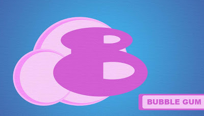
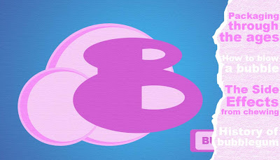
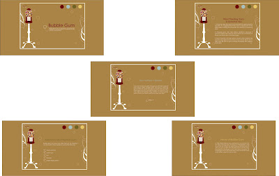
So I went back to the drawing board. I completely switched everything: colors, style, and layout. I think it was a good decision. I am pretty satisfied with how it all came together. It doesn't have much animation to it, but I think it does have a nice design. So I consider it a success. I could go back and add more animation, maybe some audio with the gum ball machine. Other then that no real complaints with how it turned out.

Check it out for reals go to

Typography Animation

I had a good time putting this project together. The hardest part for me was trying to decide on what movie to do. I wasted too much time trying to decide which quote to use. I am pretty sure that at each critique I had a different quote that I was going to use for the animation.

I started out using a quote from a scene from Matilda. My ideas for the animation poster were all over the place and I had no idea really how to go about it. I wanted to make an awesome Typography Animation Poster using great design that would just wow everyone. I am pretty sure that the exact opposite was my end result. I came up with a few animation ideas that needed a lot of help. I had so much to do to fix up my rough drafts that I thought I'd be better off just going into a different direction all together.
So for the actual Animation Poster critique I decide to do a quote from the movie, "The Man Who Knew Too Little." I spent most of my time doing a typography illustration of a hand shaped like a gun, similar to the hand on the on the cover of the DVD which explains a lot about the movie. Which I was pretty pleased with how well it was turning out, but it was taking up a lot of time to do.

About half way through the hand, I decided it would make more sense to create an illustration that would go along with the actual quote. So I switched tactics about four hours before the critique. Not that best move, I was obviously struggling hard core with this project. Anyways this is what I came up with.
Then it came time for the actual animation part. I had no idea how I would animate that quote. There was nothing exciting in the voices that I could even go off. So for the third time I switched quotes. I decided to do a quote from the TV show, "Friends." I had a good time creating it in Flash. Although it was very time consuming, I thought it was quite enjoyable to animate the letters to go along with the quote. After days of constant work I believed I finished about a half hour before the critique. Awesome! I was pretty proud of how well it turned out. Obviously I could always go back and do more, but for my first experience with Flash i don't think it was half bad.

Tuesday, December 14, 2010

HTML Site

Creating an HTML site was pretty difficult to get the hang of. Starting out was the worst part, but it definitely got easier as time went on and it almost became fun. It was very rewarding to have something work after spending forever trying to get it figured out.

I made a website for my sister and brother-in-law’s dogs. A website that would show and help sell their Cocker Spaniel puppies. Normally these kinds of websites are crammed with information, not set up with a good page layout, and are just plan messy looking. I really wanted to try making a clean and simple site that could still include the needed information.

I drew a few sketches of some different ideas of what I could do. Then got on the computer trying to add colors and what not to it. I came up with a few ideas that I really liked. I illustrated stylized Cocker Spaniel dog that I liked so I tried to play off that creating a website that would follow the same style. Coming up with a few different ideas that might work with the illustration.

In the end simplifying everything as much as possible looked best. The layout I choose to do was clean and simple. It made it easy to follow suit with my other pages. I had to come up with a few more similar illustrations of Cockers for the other pages. Which I was surprised most of them worked out pretty well. I am not a fan of the illustration for the litter page, but I just couldn’t seem to get it right after countless attempts. It turned out ok but it’s not my favorite.

After finishing the Cocker illustrations I played around with a few ideas for my logo. I came up with one pretty quick, which was nice. I just tried the different color options I could apply to the logo, than I just had to decide on a background color for the page before I started with HTML. After looking at my computer thumbnails again I decided to go with the tan color. I liked how it looked with the black and white lettering.

Then it was time to start HTML. I had no idea where to even begin. Once I was able to get started I slowly got the hang of the HTML coding and how to get it to work with CSS. I was able to get the page to set up the way I wanted which I felt was a big feat. Once I had figured out the home page for the most part it came together easily. I even almost started to enjoy it.

After hours in the Lab I was finally able to upload a fully functioning site. I was very pleased with how it turned out and was excited about everything I had been able to learn about HTML in just a few days. Despite the many headaches, I found that for the most part enjoyed the project and enjoyed being able to work with HTML. Below are a few of the pages, but check out the actual site the best part is that it functions! The URL for my site is

http://www.fall10.graphicinterfacedesign.com/students/lporter/html/newboldscockers/Root%20Folder/