

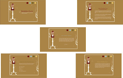


I made a website for my sister and brother-in-law’s dogs. A website that would show and help sell their Cocker Spaniel puppies. Normally these kinds of websites are crammed with information, not set up with a good page layout, and are just plan messy looking. I really wanted to try making a clean and simple site that could still include the needed information.
I drew a few sketches of some different ideas of what I could do. Then got on the computer trying to add colors and what not to it. I came up with a few ideas that I really liked. I illustrated stylized Cocker Spaniel dog that I liked so I tried to play off that creating a website that would follow the same style. Coming up with a few different ideas that might work with the illustration.

In the end simplifying everything as much as possible looked best. The layout I choose to do was clean and simple. It made it easy to follow suit with my other pages. I had to come up with a few more similar illustrations of Cockers for the other pages. Which I was surprised most of them worked out pretty well. I am not a fan of the illustration for the litter page, but I just couldn’t seem to get it right after countless attempts. It turned out ok but it’s not my favorite.

After finishing the Cocker illustrations I played around with a few ideas for my logo. I came up with one pretty quick, which was nice. I just tried the different color options I could apply to the logo, than I just had to decide on a background color for the page before I started with HTML. After looking at my computer thumbnails again I decided to go with the tan color. I liked how it looked with the black and white lettering.


Then it was time to start HTML. I had no idea where to even begin. Once I was able to get started I slowly got the hang of the HTML coding and how to get it to work with CSS. I was able to get the page to set up the way I wanted which I felt was a big feat. Once I had figured out the home page for the most part it came together easily. I even almost started to enjoy it.
After hours in the Lab I was finally able to upload a fully functioning site. I was very pleased with how it turned out and was excited about everything I had been able to learn about HTML in just a few days. Despite the many headaches, I found that for the most part enjoyed the project and enjoyed being able to work with HTML. Below are a few of the pages, but check out the actual site the best part is that it functions! The URL for my site is
http://www.fall10.graphicinterfacedesign.com/students/lporter/html/newboldscockers/Root%20Folder/



HTML Google: www.google.com
This site is successful because of the convenience of the site. Besides the fact that it’s a very well-known site that is makes online researching quick and easy, it is very straight forward and easy to use. It uses a simple design that is quite plain so that the content of the page is easily located. The layout is very standard and simple making the site convenient to navigate to where the viewer would like to go.
The layout that Google uses makes the page very simple to navigate. Although this site is a major window for the World Wide Web; the simple home page allows the viewer to successfully direct where they’d like to go next according to their needs. The main portion of the page is shown by the large colorful font located directly above the search bar. Which is the main tool used on this page, allowing the viewer to spot instantly.
The first thing the viewer notices when pulling up this page is the large, colorful Google font. It uses Visual Hierarchy to attract the viewer first to the Word Mark then to the search bar located directly below it. It has very few words on the simple home page, allowing the viewer to choose where they would first like to go, then giving more information after selecting where they would like to be on the Google website, where it is a search of some sort or Gmail. The web page itself is mainly white, with black or blue words; most of the color shown on the page is seen on the Google word mark attracting the viewer right to it.
Google is a large online search engine. It uses is a combination of both text and images, mainly text though. Because the content of the website is so large, it uses strictly text on the homepage before the viewer goes deeper into the site depending on what they are searching for. Even Gmail is still mainly text except very few picture icons to display the messages quicker.
This site is communicating to a very large audience. Young and Old all use this website, assuming of course one knows how to properly use an online search engine. It is a website for all ages. The simple design is what makes this website work so well for all ages. Not being too specific for one generation over another.
Flash Café Rio: caferio.com
Café Rio’s website is successful because of the design of the page. It has a very neat style to it, which coordinates very well with the style of their Café Rio restaurants. It is a very interactive page making it more enjoyable for the viewer. The interactive site is a good way to advertise to the customers what is available and the different deals that are going on. It really does a great job showing what is available for the customer.
The navigation on this site is pretty straight forward. Depending on what the viewer is trying to do the website shows different categories for options to click on the home page. It makes the site very simple and easy to use. As you click from page to page, the layout and everything stays constant except the main screen part which shows the information you are looking at.
Café Rio’s website coordinates very well with their restaurant. It uses the same colors mainly red, orange, yellow, and black. The site has visual Hierarchy to show the main information in the large screen in the middle of the page. To show the viewer where they should look for the information they are inquiring about the site uses a lot of animation and interactivity to draw the viewer’s eye before showing the information. The font used throughout the page is very similar in size besides the Café Rio logo and a few words shown on the center of the screen.
This site is mainly visual, using animation and illustration to attract the viewer. It does use words to show where different searches are located but the words are secondary to the entire image of the page.
The site’s audience is probably young adults to middle age adults. An audience that has the need, knowledge, and capabilities to get onto their site to find out what they would like to know. This site does effectively communicate to the viewer the information it is trying to get across. Any questions the viewer might be inquiring about is mainly shown on the site with easy navigation.